
The below are my final logo's produced in digital form:
Wednesday, November 30, 2011

Wednesday, November 9, 2011


Tuesday, November 8, 2011


Wednesday, October 26, 2011
Use advanced features of computer applications
The following is the original tutorial:
Changes to the tutorial to make it my own:
What is the outcome of your tutorial?
To teach viewers of this tutorial to be able to complete a unique Retro style image
Where are you going to record it?
At home - Where I don't look like such a weirdo? ha!
What software do you intend to use?
QuickTime Player - Screen/Audio Recording
Similar Tutorials:
One
Two
Final Result:
My Video
Click the above link to go to my tutorial on youtube.
Changes to the tutorial to make it my own:
- Applying a texture to the image into the tutorial
- Use a different image (own photograph)
- Use of different light leek
- Use own unique settings
What is the outcome of your tutorial?
To teach viewers of this tutorial to be able to complete a unique Retro style image
Where are you going to record it?
At home - Where I don't look like such a weirdo? ha!
What software do you intend to use?
QuickTime Player - Screen/Audio Recording
Similar Tutorials:
One
Two
Final Result:
My Video
Click the above link to go to my tutorial on youtube.
Tuesday, October 18, 2011
CUVCOR04B Critique Report.
On the Monday 17th October our class sat down together in the theory room and critiqued our work as a whole and also individually. The following is my summary of that critique session.
It was concluded that our overall strengths were that our use of colour within our pieces of work was really good. Most of the work pieces from each student was unified and had a sense of consistency throughout all of the pieces and that the work pieces have the feel that they are from the same company and the colour scheme filters throughout all of the work.
Another of our strengths was our attention to detail. Obviously, this isn’t for every piece of work however overall it was key in the quality of our work.
Our main weakness was Typography. I think using inappropriate typefaces, incorrect/inappropriate type sizing, incorrect spacing etc is something that let us down. We have not yet studied Typography in depth so I believe this is why we are generally weaker in this area.
Flamez burger & beer bar was the company I had to design a corporate identity for. I first started with the creation of the logo and slowly worked on it until I had something that I was happy to show the client (Tania). Tania requested a few small changes in regards to the spacing/kerning of the letters and also the to the colours used. Overall I ended up happy with the result and believe that the client was also.
For my webpage mock-up I first researched other similar webpage’s to get a general idea of the look and feel that they had. I then adapted that to the company that I was creating the branding for and came up with a simple and tidy design that I think was realistic.
For my 3D Promotional product I chose to create a wine & beer glass promoting the company. I think I could have put more effort into this particular area as I could have actually got the beer & wine glass and stuck on a see through logo. This would have made it more interesting and give the class/teacher more an idea of what the product would look like.
For my shop front I chose to take a photograph of a shop front of a similar business to the one that I was creating a corporate identity for – The Thirsty Crow. I was not completely happy with the result as I think I could have been more creative with the shop front and made it look more exciting. I was glad that I had the photo printed however as I think it made it appear as if it were a real shop front.
For my A5 booklet I made the booklet about the beers that were sold in the establishment. Its overall look was sufficient and followed through with the colour theme however it was missing the companies identity which was its biggest downfall. If I were to have a do-over it would be included on this document. Also, on the back of the A5 booklet I placed the “Drink Responsibly” logo in which didn’t really neatly fit in with the overall design.
For the slogan of the company I chose to go with a script font that I think fit in with the logo however I am unsure weather it followed through with the consistency of the typefaces used within all of my documents?
Overall, I am happy with my work but as with all of my work I think it could always be improved upon in numerous areas. I am glad that I mounted my work, as I was the only one to do so within the class, however I think that more effort could have gone into this process to make sure that it looked even more professional.
Monday, October 3, 2011
CUVCOR04B - Originate conecpt for own work & conduct critical discourse.
Revision Meeting One:
30th August 2011
Summary:
My first revision with Tania (the client) was mostly discussing the logo concept which I had developed (what she did & didn't like about it). I also showed her some samples of logo's from other similar companies so she had an idea of what they looked like. She then made a few notes on the documents which I supplied her to view (shown below). She was unhappy with the slogan and advised her that if she came up with something she liked before the ext meeting I'd be happy to use that slogan. I gave her an idea of what I was developing for the 3d promotional product and the A4 booklet - she liked the work so far.


Revision Meeting Two:
13th September 2011
My second meeting with Tania (the client) was mainly focusing on the webpage mock-up - I gave her a sample of what I had so far and she gave me some feedback about changes which she would like made to the design. We also went through the same process with the A4 Booklet as it was now at it's "complete" stage excluding the changes which Tania wanted to be made to the document. Also, she provided me with a slogan that she felt was appropriate & that she liked. See below.

30th August 2011
Summary:
My first revision with Tania (the client) was mostly discussing the logo concept which I had developed (what she did & didn't like about it). I also showed her some samples of logo's from other similar companies so she had an idea of what they looked like. She then made a few notes on the documents which I supplied her to view (shown below). She was unhappy with the slogan and advised her that if she came up with something she liked before the ext meeting I'd be happy to use that slogan. I gave her an idea of what I was developing for the 3d promotional product and the A4 booklet - she liked the work so far.
Revision Meeting Two:
13th September 2011
My second meeting with Tania (the client) was mainly focusing on the webpage mock-up - I gave her a sample of what I had so far and she gave me some feedback about changes which she would like made to the design. We also went through the same process with the A4 Booklet as it was now at it's "complete" stage excluding the changes which Tania wanted to be made to the document. Also, she provided me with a slogan that she felt was appropriate & that she liked. See below.

Wednesday, September 21, 2011
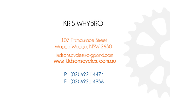
My Role with Kidson's.
My Role:
Artistic Director
What I did to play this role in the team?
As the Artistic director I was required to check over different documents before they were given/sent to Kris to ensure they were correct, precise and appropriate. I worked with Jarrod the other Artistic Director to supply the team with feedback on all designs which were produced to be present to Kris. Both Jarrod and myself supplied the team with ideas/inspiration and web pages which we felt were inline with the companies look/feel which would help the team have an idea of the type of direction they should be taking with their logo. When all of the documents were ready to be presented I signed up to the website "Prezi" and created a simple but neat presentation which could be used to present our work to Kris in an appropriate and professional way.
Perspective Tool - Practice.
I completed the perspective tutorial again as practice for today's "test".
Here is the result. ^_^

Tuesday, September 20, 2011
Research & Apply Techniques: Corporate Stationary.
C O R P O R A T E I D E N T I T I E S
(Weighing 60%) - Received 20/09/11
Companies:
- Boring: White's Building & Construction
- Okay: Bella Botique
- Good: Ready 2 Create
Task One:
Come up with a logo for the 3 companies you have been given.
Then for each company you must then create the following:
- Letterhead
- Business Card
- With Comps Slip
Task Two:
Create an additional item for each of the companies to go with the letterhead, business card and with comps slip
Due Date- Tuesday 25th October 2011
Monday, September 19, 2011

Rapid Logo Study 3: Trident Grill Family Bistro.
Final Design: Trident Grill

I received high points for this design however, I didn't receive the most. I think this is because it's not enough of a unit. I think I got high marks because of my use of colour - it's the same as the winning logo's colours.
Altogether, I received 30 points for my design.
Winning Design: Matthew Drake's

I think this design was the winner because of it's simplicity and use of colour.
Logo received 33 points.
Logo received 33 points.

Monday, September 12, 2011


Business Stationary Critique.
Smith & Jones Lawyers:
Mango Creative:
Hoot Kidswear:
- The square images do not communicate the "S & J" clearly enough and can be read the wrong way
- The typeface used was really good
- Ensure the "with compliments" is more noticable & stand alone
Mango Creative:
- Make sure that the style carries through to all of the different stationary documentations
- Ensure the "with compliments" is more noticable & stand alone
Hoot Kidswear:
- The blue colour used in the background is crap!
- For the business details ensure that you don't use decorative typefaces - use clear legible typefaces for the contact details
- Ensure the "with compliments" is more noticable & stand alone
Wednesday, September 7, 2011
Perspective Tool Tutorial.
The perspective tool tutorial was challenging - However, I think it was a great excercise with nice results. I think it's something that takes time to understand how it works and be able to use it sucesfully with amazing results all the time.
Here is my "city scape" which I created using the tutorial:

This is the colour scheme I used for the above results:

Rapid Logo Study 2: Pip-squeaks Kids Playcentre.
Final Design: Pip-Squeaks Kids Play Centre


I think my logo was one of the winners because of it's unity and also the use of bright and fun colours which was appropriate to the company.
Tania and I both received 34 points.
Tania and I both received 34 points.

I think Tania's design received high marks as it's very unified. It's neat and easy to interpret.
Tuesday, September 6, 2011
Corporate Identities & Paperwork.
Smith & Jones Lawyers:
Letterhead

Business Card - Front & Back


With Compliments

Mango Creative:
Business Letterhead

Business Card - Front & Back


With Compliments

Hoot Kidswear
Business Letterhead

Bussiness Card - Front & Back


With Compliments

Subscribe to:
Posts (Atom)
