Monday, May 30, 2011
Monday, May 23, 2011
Creation of Freeload Logo.

First Design Ideas:
6 Different Designs tweaked differently to create 15 unique logo's.
The logo with the red circle was chosen as the favourite out of all of the logo's.

Re-creating Chosen Logo:
After choosing the favourite logo from the first section I changed small things with the chosen design. I then created 3 logo designs which are completely different to the original chosen logo. The logo circled in red was the chosen logo for the task.
Small changes to the chosen logo:
I made some small changes to the logo and was finally happy with the final logo - shown in the red circle.
After speaking with Dan..
Speaking with Dan I got the following:
I need to make my logo more technical - more in relation to the field the logo has been created for.
The colouring I used he liked - therefore no changes needed.
I need to check it Wi-Fi is trademarked/ usable in the logo.
Exploring Gestalt Principles - Proximity.
Task: Create a simple A4 image that explores the use of proximity.
Explanation:
I chose two simple clean sections to display Proximity. I used two different breeds of dogs to create a different between each section.
Web Definition:
What is Proximity to me in regards to Graphic Design?
It's simply the groups which are formed in different elements of design. It can be found within web designs and also printed graphics.
Monday, May 16, 2011
Optimus Prime - Assessment.
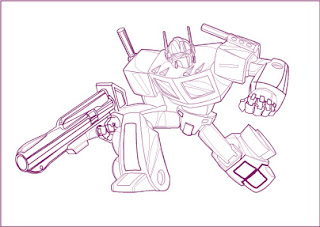
The Original JPEG of Optimus Prime - from Liam's Blog.

The Final Outline of Optimus Prime - Completed.
Using Live Paint to colour in Optimus Prime - In Progress.
Completed Assessment - Optimus Prime.
Wednesday, May 11, 2011
Thursday, May 5, 2011
Tuesday, May 3, 2011
Pluto, Live Paint.
Pluto The Dog
Cartoon character chosen by myself to recreate using the pen tool and live paint in Adobe Illustrator.

Felix, Live Paint.
Felix The Cat
Cartoon character chosen by myself to recreate using the pen tool and live paint in Adobe Illustrator.

Monday, May 2, 2011
Sunday, May 1, 2011
Creating Logo, Design Breif.
Client: Cactus TV Network (channel 4)
Task: Creating 2 separate logo's for this business
Brief:
I was unable to attend this class but through studying other class mates information my brief for the client is is follows:

Task: Creating 2 separate logo's for this business
Brief:
I was unable to attend this class but through studying other class mates information my brief for the client is is follows:
- Logo is for a Comedy channel
- Channel runs 24 hours
- Targets all age groups
- Requires a simple, non fussy logo design
- Logo will be used for numerous things such as crew cars, staff uniform, business cards etc
- Logo needs to be versatile and work as a watermark
- Logo with vibrant colors - steering away from purple

Client mentioned that they do like the Comedy Channel logo aesthetically, However this is the reasoning behind steering away from the use of the color purple. Obviously it's more than likely the Comedy Chanel will be a competitor Channel.
Logo's & Business Cards - Liam's Class.
Logo One: Dislike.
Australian Made Logo
Reasoning:
Although this is in keeping with the "Australian" colours and a native Australian animal I believe for this to be a more attractive logo it needs different colours - or the colour used in a more modern style.
I think the logo looks out-dated and need to be modernized to become more noticeable and eye catching.
Logo Two: Like.
Mozilla - Firefox Web Browser

Reasoning:
I think this is a very well thought out logo that is eye catching and also attractive. It's suitable for the purpose in which it was created for. It entwines the fox, fire and also web browsing but in a simple manner which I think is key to a successful logo. Simple, Stunning, Memorable.
Business Card One: Dislike.
Chile Chews
Reasoning:
I think this business card simply looks unorganized, ugly and amateur which may result in the customer base to be less likely to want to do business/ buy their product. It does not look modern nor simple. Also, the use of the photo I think is simply showing the lack of quality when it comes to the card itself.
Business Card Two: Like.
Paul Hartsook
Paul Hartsook
Reasoning:
I love the simplicity of this business card. I think it keeps in relation with the business - the back of the card looks alike a speaker or sound waves. There is a good amount of information supplied on the card. I think the colors are appropriate for the business and I don't think it would be outdated quickly.
Subscribe to:
Posts (Atom)


 ɪ
ɪ


