Wednesday, July 27, 2011

Colour Assessment: Anger, Calm, Excitement.

Explore The Use Of Colour:
Assessment (3) Images


Anger

Reasoning:
Above is my completed image for the depiction of the emotion “Anger” using only colour and shapes to communicate that message.  For this particular image I have chosen to use various shades/tints of red as I think that most people will generally see red as the colour linked to anger. I researched the meaning / phycology behind the colour red & discovered that dark reds meanings include rage, anger, malice and wrath – therefore the use of red was perfect for this task. The different shades of red working with numerous different sharp, pointy, angry shapes makes for a great result which I think depicts exactly how I see Anger.
Calm


Reasoning:
Above is my completed image for the depiction of the emotion “Calm” using only colour and shapes to communicate that message. I have used soft blue tones for this task as I believe that it is best suited for this emotion and conveys the correct message in an effective way. I researched the colour blue and the meaning/phycology behind the colour and found that Blue has a calming/soothing effect on people and is a very tranquil colour – therefore I believe it suited this task completely. However there was mention that too much blue can convey sadness/unhappiness which is why I didn’t use too much blue for this task. I used smooth, flowing and soft shapes as I think they are most calming so soothing.
Excitement:
Reasoning:
Above is my completed image for the depiction of the emotion “Excitement” using only colour and shapes to communicate that message. This task I found more difficult to find suited colours however, with some research I discovered that bright colours such as yellow, red and orange are generally best suited to convey excitement which is why I chose those colours for this task. I used the round shapes to suggest the building of the excitement and the explosion when the reason behind the excitement arrives with the triangular shapes. The swirls are the show the swirling of the emotion as it grows through the body.
The following webpage was used for research:

Inspiration - Children's Map.

 I love this style. Simple yet extremely effective and aesthetically pleasing.
More complicated - Yet still quiet simple and effective.


Very simple styles - I love simplicity!
A more textured and complicated style.

More complex style - Lots of texture and gradients/shadings. Very effective.

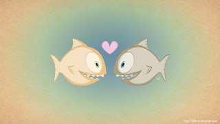
Pirranah Love: My favourite Image. ^__^

Tuesday, July 26, 2011

Thai Cuisine.

 Image Only.
 Image & Text.

 Vector Only.

 Vector & Text.

Minimalism.

Monday, July 25, 2011

Hue, Value & Chroma: Take 2.

 
Hue:
Using the slider I made the colours warmer at the front (adding more red) and cooler to the back adding more blue. An image showing depth using Hue.

Value:
Using the Brightness Slider only I created a daytime scene (darker to the front & lighter to the back). Making the colours with more black a shade and more white a tint. I created an image with depth using value.

Chromaticity:
Using only the Saturation (how strong/vibrant the colour is) slider I created a daytime scene. Making the colour towards the front more saturated and the colour towards the back less vibrant.

I completed this task again simply to reinforce what I have learnt & to make sure that what I have done is correct and that I understand it.


Own Examples: Hue, Value & Chroma.

The following are my examples which i've created to display Hue, Value & Chroma.

Hue:
Creating an image with warmer colours to the front and cooler colours to the back of the image.
I have used an orange (warm) for the tree's visible to the front then adding more green as it moves backward. The hills are a green (cool) colour then the sky is blue (cool)

Value:
I have created this scene by adding more black to create the darker colours used within the picture and more white added to the colours towards the back of the image.

Chroma:
I started this image with a green colour and had the front images completely saturated and then gradually created the images toward the back less saturated.


Wednesday, July 20, 2011

Colour - Hue, Value & Chroma.

Define the following terms:

Hue: Is simply a colour or shadow. Hue is the most obvious characteristic of a color. There is really an infinite number of possible hues.

Source: http://www.greatreality.com/color/ColorHVC.htm

Value: Is simply the amount of black or white added to a colour. If white is added then it creates a tint. If black is added to a colour then it is a shade.

Chroma: Is simply the saturation or intensity of the colour displayed.

Logo's & Appropriate colouring.

Explore the use of colour

Logo One: The Lawson Inn
Original Logo Design

Chosen Colour/s:
Blue or Purple.
Reasoning:
 For this particular establishment I believe that Blue would be a suitable colour as it would communicate that it's confident, powerful, established and trustworthy. Also, it's said that most people like at least one shade of blue.

However, Purple would be another choice as it communicates that it's expensive, regal and sophisticated.

I beieleve that it will vary on the customer base that the astablishment is aiming to attract. 

Logo Two: Hungry Jacks
Original Logo Design

Chosen Colour/s:
Yellow and Red
Reasoning:
For this particular establishment the colours used in the original logo are the most appropriate colours.
Red is known to make people hungry which would be of great benefit as Hungry Jack's is a fast food establishment. It's also a very eye catching colour which can represent excitement, energy and adventure.
The Yellow used is appropriate as it's a colour which is playful and conveys positivity, happiness and joy.

Logo Three: Fitzpatricks Real Estate
Original Logo Design

Chosen Colour/s:
Blue
Reasoning:
For a Real Estate Agency I belive that Blue would be a very effective colour to use for their logo design as it conveys confidence, authority, success, security and loyalty.
These are all qualities which a customer base for a Real Estate Agencie would be looking for, therefore the use of blue for a logo would be a very effective non-verbal way of communicating the above qualities to their customer base.

Logo Four: Crown Custom Computers
Original Logo Design

Chosen Colour/s:
Blue And/Or Black And/Or Grey
Reasoning:
For this particular company I think that the colour blue is well suited to be used within/for the logo as it conveys confidence, loyalty, power and succuss to their customer base.
I think grey is also a well suited colour to this business as it helps convey a corporate mentality, respect and stability. I think all of the above things which are being conveyed would help the customer base to trust the company with their computers as they are successful and also loyal and respectful.

Logo Five: Matt Jenkins Homes
Original Logo Design

Chosen Colour/s:
Blue And/Or Brown And/Or Grey
Reasoning:
For this particular company I think the colour Blue would be well suited as it would convey to customers that they are confident, established, loyal, successful and trustworthy. These are all things which would be good attributes for a company who is building homes therefore.
The colour brown may be applicable to use as it conveys that they are serious and it's also a woodsy colour - and builders generally would use wood.
Grey could also be used successfully for this logo design as it portrays a corporate mentality, practicality and also stability.

Logo Six: Beyond Blue

Original Logo Design

Chosen Colour/s:
Pink And/Or Light Blue And/Or Green And/Or Yellow
Reasoning:
For an organisation alike this one I belive that the colour pink is suitable as it can portay appreciation, gentleness, gratitude and softness. There are things which are suited to people who are in a fragile state.
I think the colour blue (light) would be the best suited because the colour is stated within the name of the comapany. I think it's also suitable as it portrays they company is calm, confident, loyal, secure and trustworthy.
The colour green could be applicable for this logo as it can portray health, healing and harmony. All things that are in regards to mental health & imporving it.
I think that yellow would be a great colour for this logo as it portrays happiness, warmth and sunshine. Things which this company is trying to achieve with it's client base.

Logo Seven: Romano's Hotel
Original Logo Design

Chosen Colour/s:
Purple And/Or Black
Resasoning:
For this particular establishment you may chose to use the colour purple within the logo design to make it look sophisticated and expensive.
I think that the colour black is also suitable as it can be seen as formal, classic and traditional.
This will vary depending on the look and feel that the establishment is aiming to achieve.

Logo Eight: World Vision
Original Logo Design

Chosen Colour/s:
Green And/Or Grey And/Or Black
Reasoning:
For an organisation like this I belive the colour grey would be well suited as it portrays respect and humility.
I think the colour black would be suited as it's classic, formal, traditional and conservative.
The colour green might be used to show harmony, health and renewal. I think that these qualities would be well suited for the reasoning/purpose of the organisation. 


Tuesday, July 19, 2011

Rock 'N' Roll

Research and apply techniques to graphic design
The following are 5 different 100 x 100 mm pictures created by myself.
They are to depict a circus theme - however, you couldn't use the word Rock 'N' Roll.

One: Image Only

Two: Image & Text

Three: Vector Image

Four: Vector Image & Text

Five: Minimalist Image/Vector - No Text


Circus.

Research and apply techniques to graphic design
The following are 5 different 100 x 100 mm pictures created by myself.
They are to depict a circus theme - however, you couldn't use the word Circus.

One: Image Only

Two: Image & Text
Three: Vector Image Only

Four: Vector Image & Text

Five: Minimalist Image/Vector - No Text