Thursday, August 25, 2011

Kidson's Cycles; Own Colour & Original Colours.

 Kidson's Cycles Logo: Colour in Logo Design

The below are my final workings on the Kidson's Logo Designs:
Original Colours Logo Design:

Obviously, the colours used within this logo are the original colours of the old logo design. I have used these colours for 1 of my logo designs as Kris wished to keep the original colours as the company is recognized with these colours.

Own Colours Logo Design:

After receiving the information on what the client was after I have created the above logo to the best of my ability with colours I believe are suited to this industry and the message, which the logo should convey. I have used orange for more than one reason the first being that it still contains one of the original designs colours, which may keep the customer happier and more open to a design that edges away from the old design colours. Also, I think that orange is well suited for this industry as a colour to represent what the company stands for as well as the feelings customers will have when purchasing their products. Orange is said to be an active, stiumlating & sociable colour. I believe that cycling is a very active and stimulating sport along with it can be a very social activity.
The colour is fairly unique compare to competitors within Wagga as very few use the colour orange within their logos and as shown below if used only a small amount.
I chose black as the colour to accompany orange. As orange is aimed at the sport itself I see black conveying the companys feel and what they are about. Black implies sophistication, elegance and modernity. I think the colours work well together to create a logo that is both modern, unique and playful/active.


The following are the two main competitors logos within Wagga Wagga:

Morgan Street Cycles:
 

Wagga Cycle Centre:

Upon deciding the final 6 logo concepts which we as a class would like to present to Kris 2 of my logo's were chosen to be used with a few minor changes. The changes are shown below and the logo's that were chosen were to be in both the original colours along with my own chosen colours.

The following website is my reference to colour psycology:

Wednesday, August 17, 2011

Type.

I came across this free font on "Dafont" and have fallen in love with it. 
It's so simple but makes type look so simple and beautiful. Sad I can love a "typeface" so much isn't it?

Kidson's Cycles; Logo Design's.

The following is the beginnings of my logo designs for "Kidson's Cycles". 

It took me a long time to get something that I was even remotely happy with. I sourced a lot of logos and images to place around my document for inspiration. 

I still have a lot of work to do but I do finally have something that I'm slightly happy with. 
Give me your opinions? ^__^
The 6 designs at the bottom are the designs I'd like to work further with. 
I actually like the orange better than the blue? Strange I know. I like the "cycle" not spread out with spacing? Why? I can't really say I just think it looks better.

Wednesday, August 10, 2011

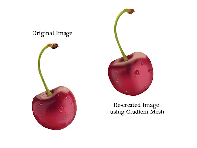
Advanced Illustrator Techniques - Gradient Mesh's.

Left is the original image which Liam gave to our class to re create using a Gradient Mesh in illustrator. Right is my cherry completed with Various Gradient Mesh's.

Rapid Logo Study 1: Snappy Jim's Lawn Mowing.

Final Design: Snappy Jim's Lawn Mowing


I think my design wasn't the winning design as it's a little too fussy. There is too much going on, Maybe simplified it could have been the winning logo.

Winning Design: Tristan Boresma's

Tristan's was the highest scoring logo with 35/45. I belive this is because of his very strong graphic. It is different and suited the brief which we were given. It was a very different concept which I think made it even better. The only thing that let it down was the type used or lack there of. It was simply just written and the logo isn't "complete". 

Tuesday, August 9, 2011

Typography Tutorials.

Tutorial One:

Tutorial Two:

Tutorial Three:

Tutorial Four:

Tutorial Five:

Monday, August 8, 2011

Kidsons Cycles Project: Progress So Far..

4/8/11 –
Bec phoned Kris Whybro at Kidsons Cycles and arranged the initial meeting to discuss exactly what he requires from us as a class
5/8/11 –
Josh emailed Kris to confirm meeting and the questions that will be asked at the meeting
6/8/11 –
Bec phoned Kris again to confirm that he received the email sent by Josh and that Monday 8th Aug at 11am was appropriate for the initial meeting with Josh and Ashlee
8/8/11 –
Email received from Kris to confirm meeting.
11 – 11.30 am initial meeting took place.
Class came together to speak about the results of the meeting.
Tania produced an email to send to Kris to confirm the details supplied in the meeting are correct and he’s happy with us to go ahead with creating logos.
Blogger Webpage created to post information in regards to Kidsons, Inspiration for logo designs etc
Gmail Account created for contacting Kris